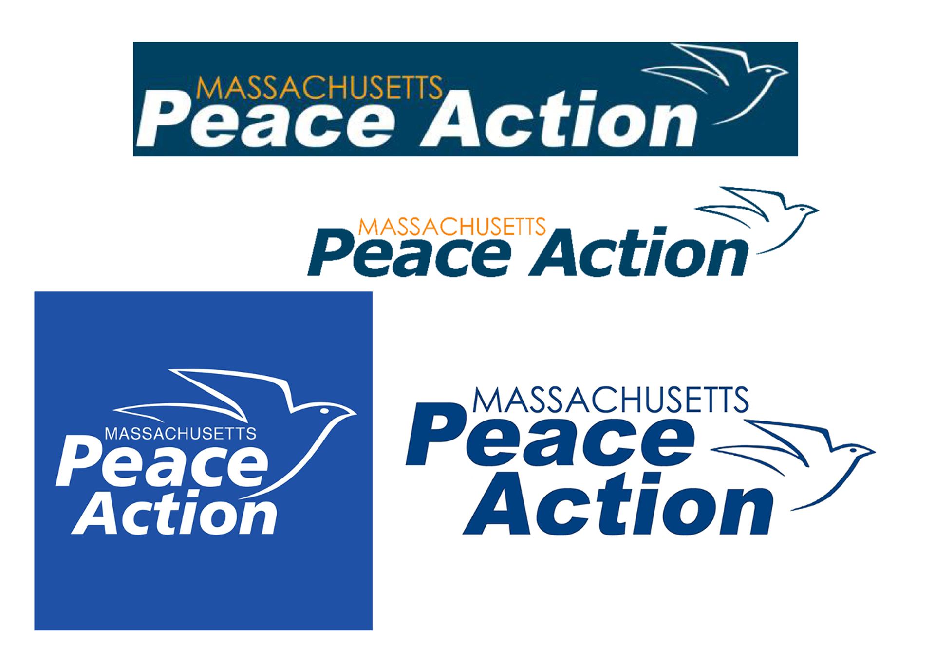
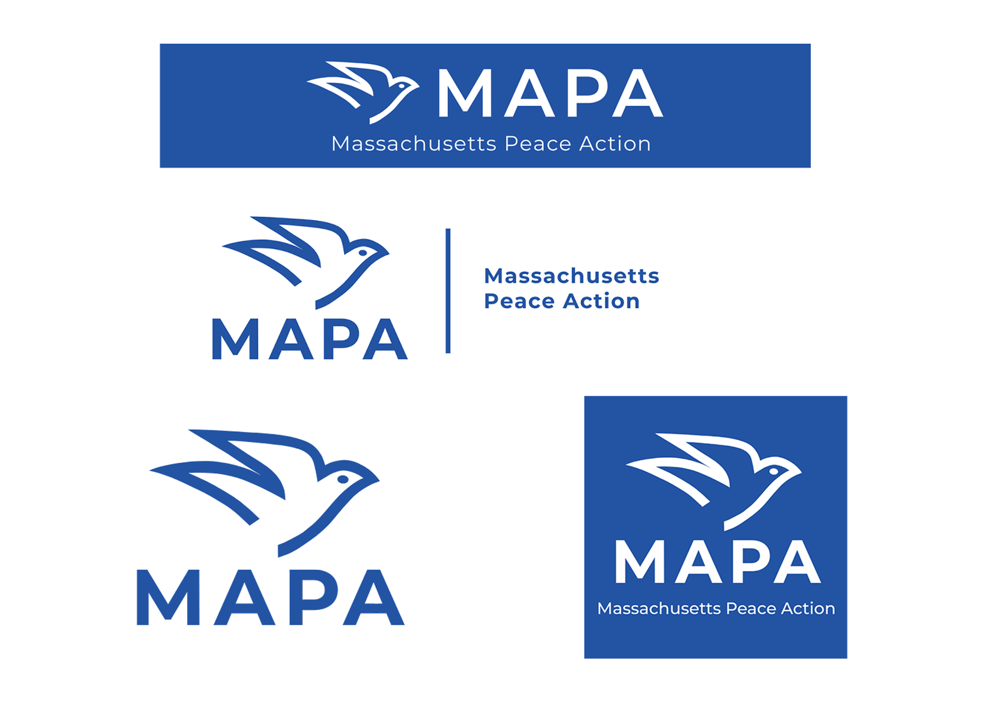
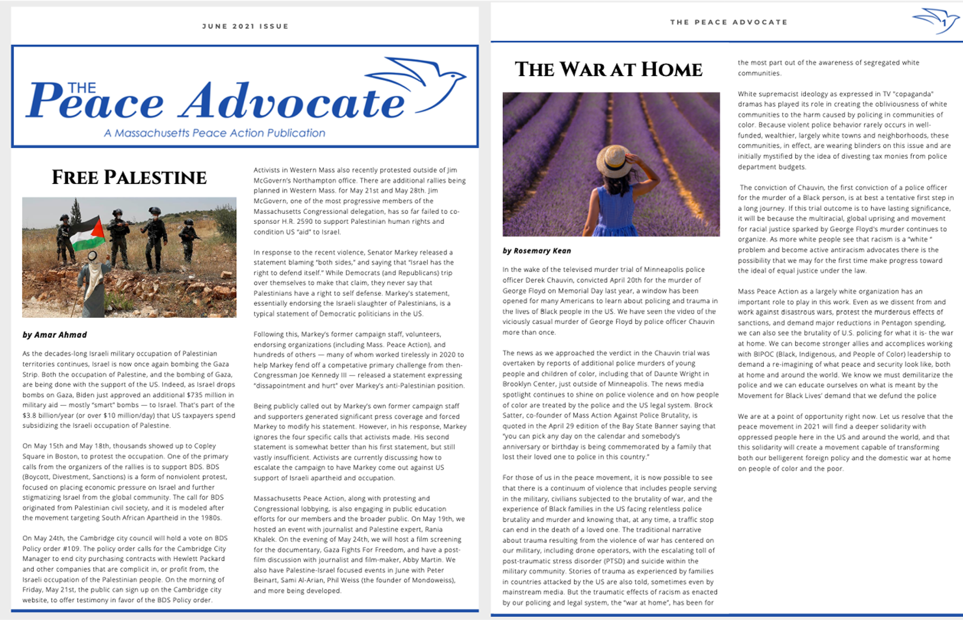
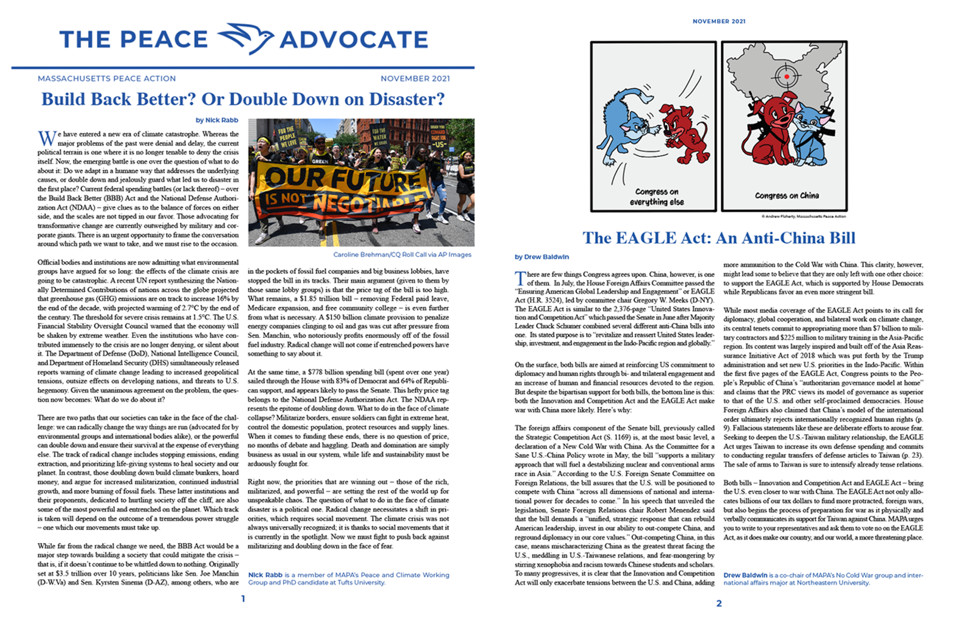
Massachusetts Peace Action (MAPA) agreed to let me redesign their logo and conduct an overall rebrand of the organization. Their previous dove logo was difficult to see on a smaller scale and the original logo and workmark was out of date. There was also unclear guidelines for color use. The rebrand includes a new dove logo and word mark, a specific color palette, and a revamp of their website and printed newsletter 'The Peace Advocate'.
Previously, the organization did not have any branding standards. Their colors and typeface were not consistent which in turn reduced credibility of anything they created. There was also an issue with naming. Those within the organization referred to the organization as MAPA (map-ah). However they did not have anything referencing this acrynomn on their website or socials. This created an issue of name recognition. The rebrand introduced MAPA to their logo and overall streamlined their branding.


The rebrand also included updates to their printed newsletter. A new logo and updated typography and layout elevated the newsletter and increased impact.

